Colors in architecture and interiors
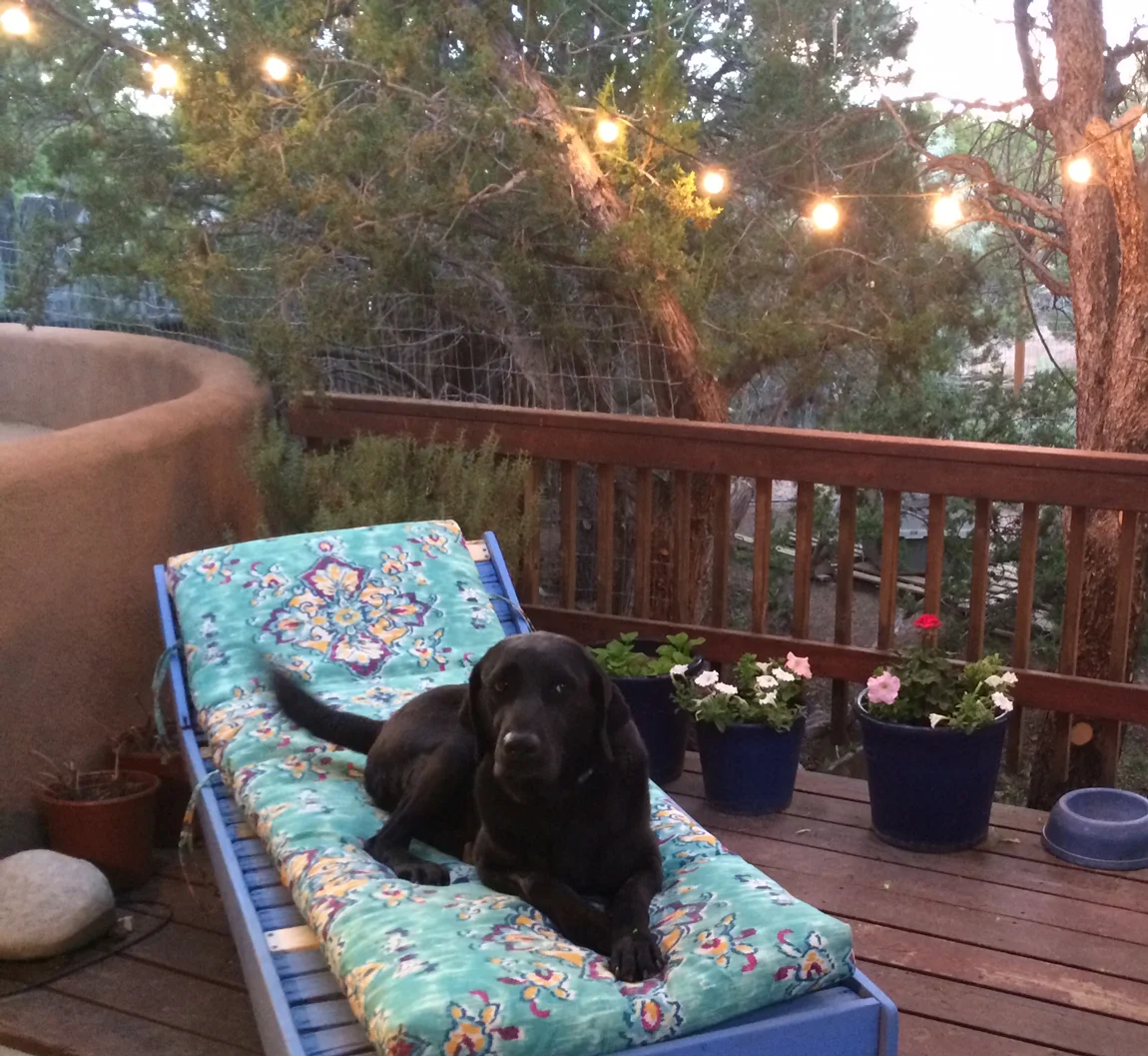
Last night we spent a really nice evening at a friend’s new house.The first thing he had done after buying his home was to paint all walls in different bright colors. The result was charming, cheerful and just right. It fits him and the location where we live – New Mexico.

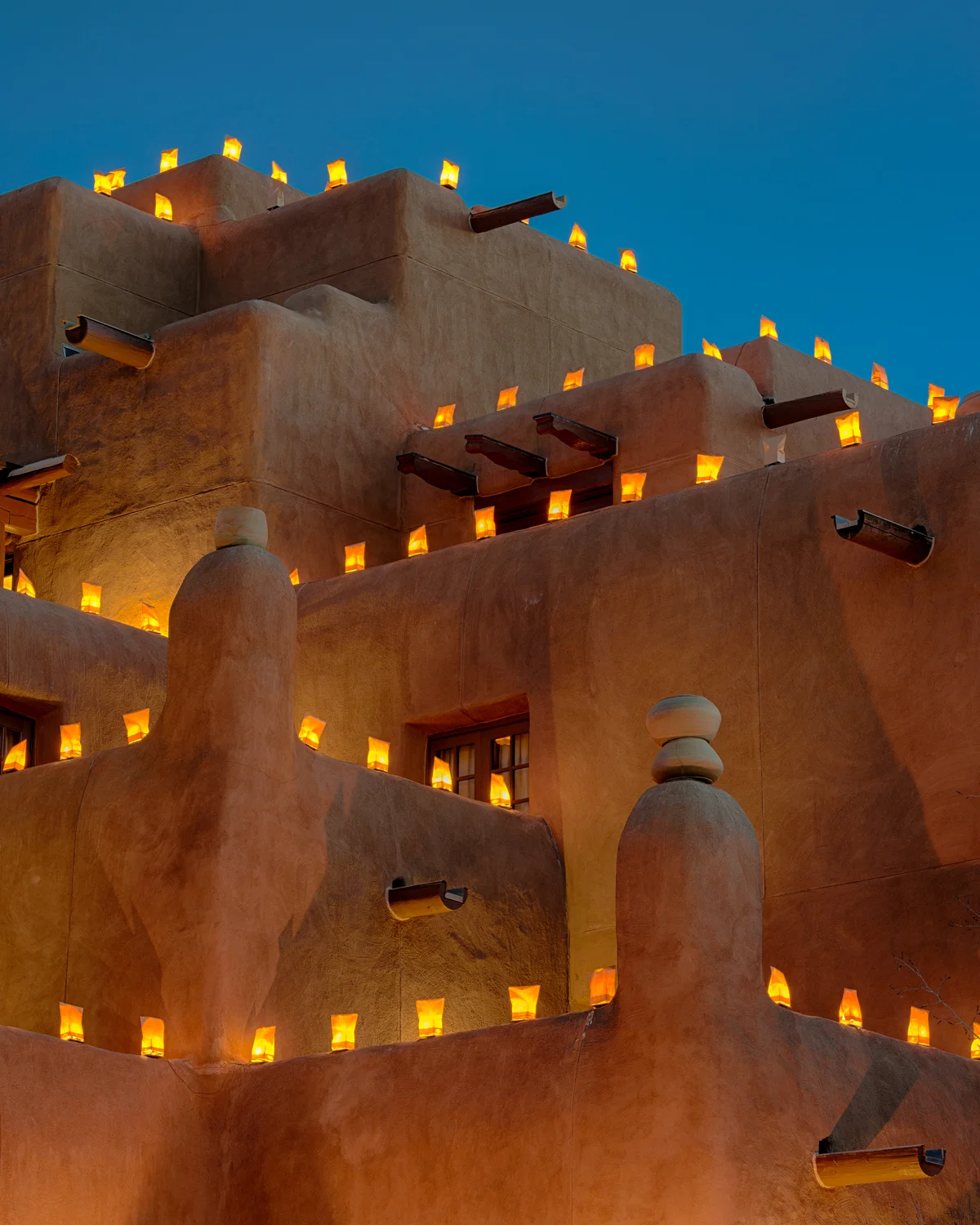
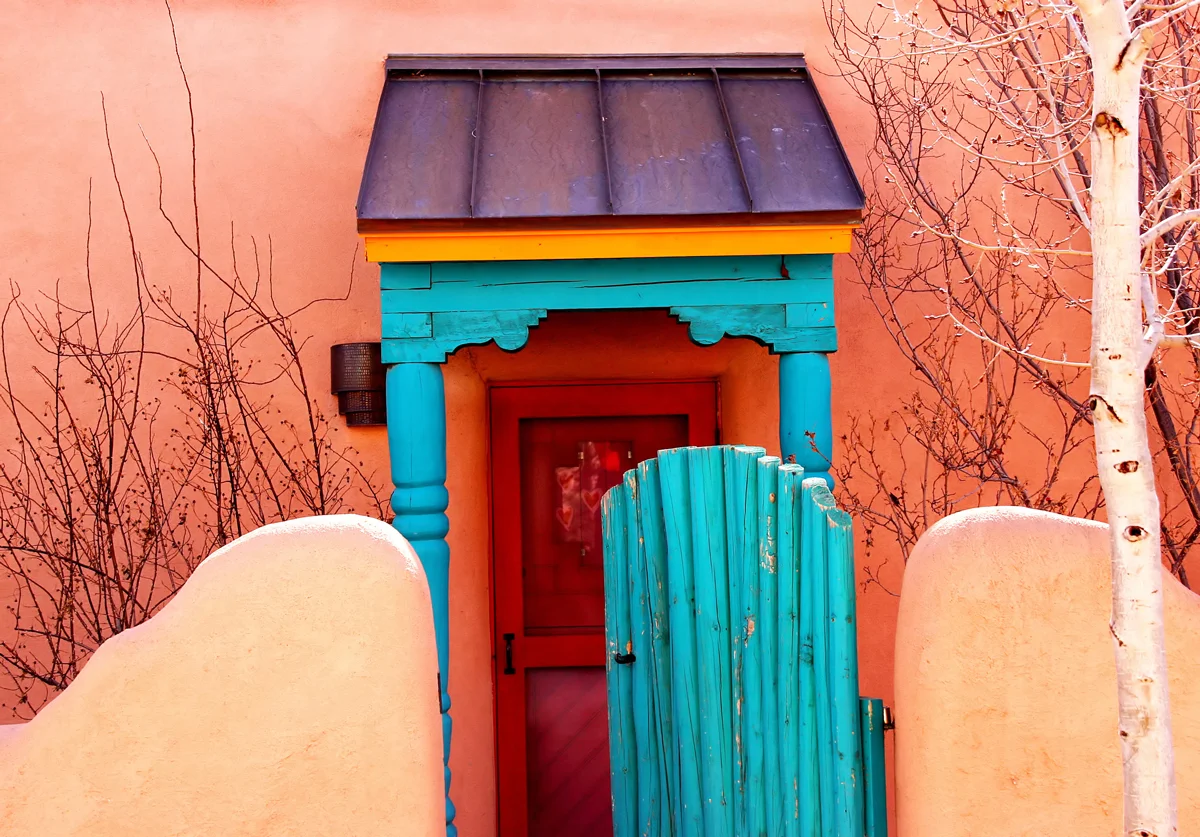
In New Mexico the color turquoise has significance because of the gemstones that have been mined here for generations. They are used in Native American ceremonies symbolizing a connection to the spirits of the sky. In many cultures around the world turquoise is used as a talisman for protection, luck and power.
Blue was historically thought to avert evil spirits and therefore used on doors and window frames. Just like turquoise, the vibrant "Taos Blue" is a wonderful match for the adobe earth tones.

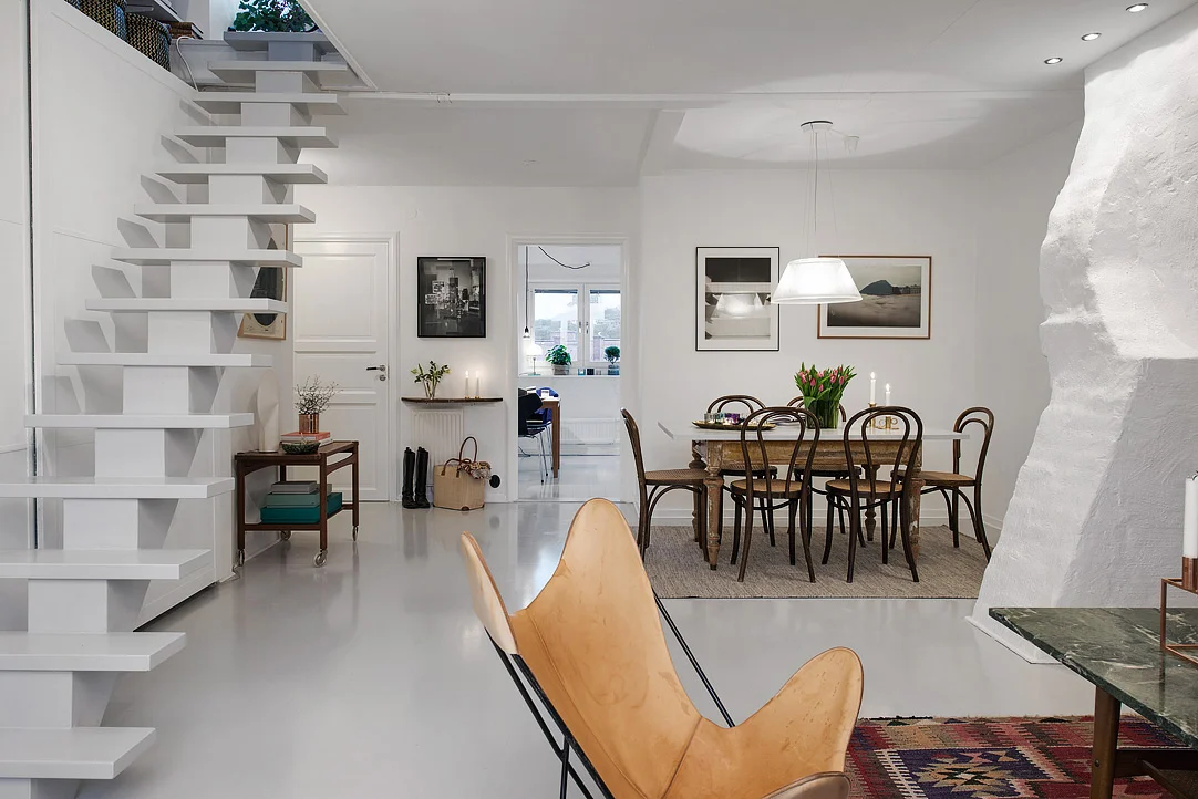
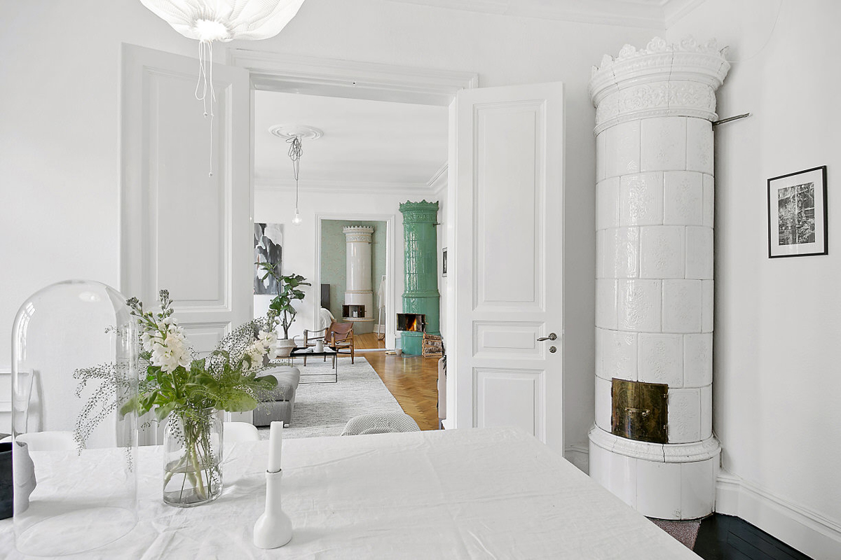
Coming from Denmark and in love with the Scandinavian design and lifestyle I read a lot of Scandinavian design and lifestyle blogs on a daily basis. It is so striking, how everything there seems to be white, light and airy. Whites combined with light wood and a few gray accents thrown in to “liven” things up.
Of course there is a reason that we see more red, ocher and turquoise walls in New Mexico than in Scandinavia. With something like 360 days of sunshine a year and the sun higher above the horizon we seem to live in a more colorful world.
In Scandinavia the winters are long and dark (that’s the reason people put so much emphasis on making their homes comfortable)– and as a blessed contrast the twilight of the summer nights is something so unique and wonderful that it’s hard to describe. Light colored interiors create a sense of spaciousness in dwellings that are in general more compact than we are used to in the US. In addition, a monochromatic, light palette add a feel of tranquility and LIGHT to the space.