Lighting Bloopers
A collection of cringe-worthy lighting solutions. Have fun!
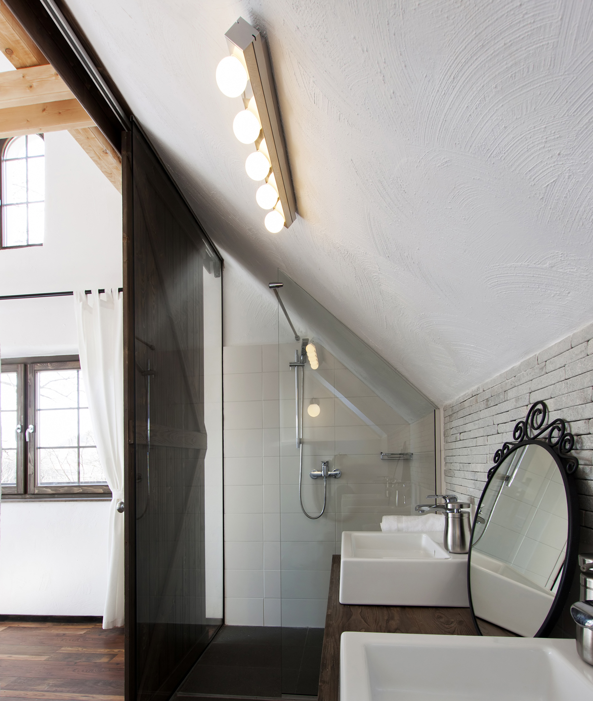
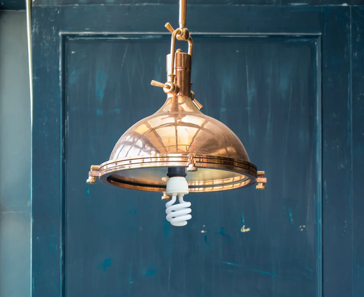
Don't do this at home. Please!! Good looking fixture, but the exposed CFL is ruining the look. (Curious, though: Which lamp (bulb) would actually fit? The socket is practically flush with the bottom rim of the fixture.)
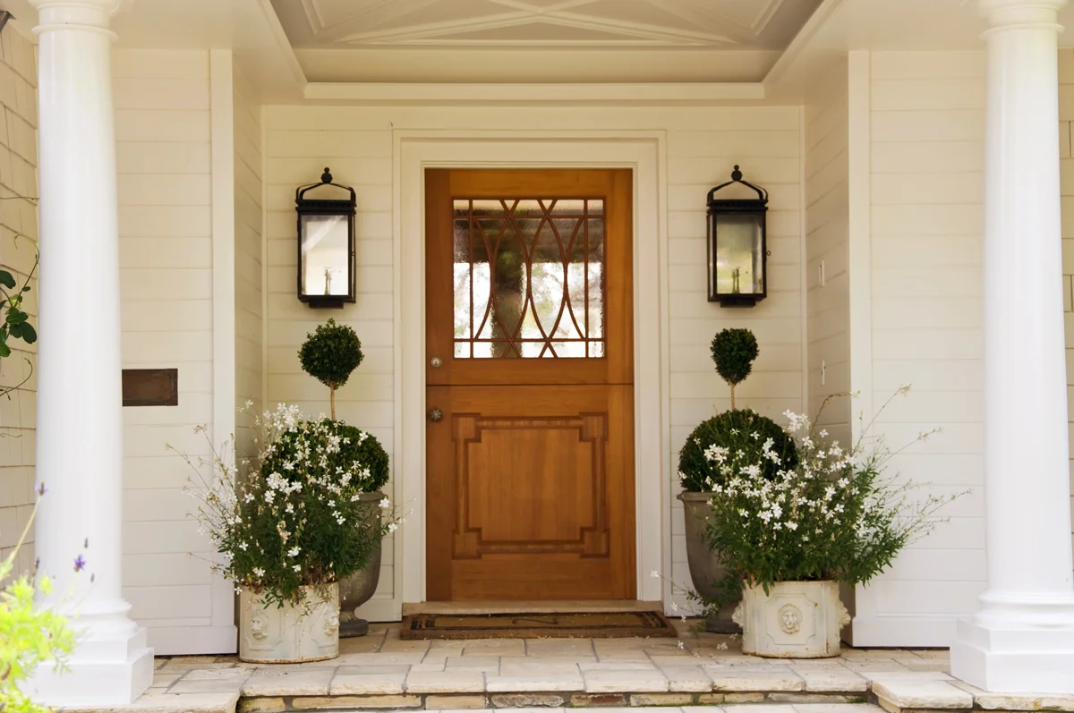
This is the effect you get from using ceiling lights as the only light source in front of your front door. Solution: Add wall sconces or anything that adds side lights.
Beware of the runway effect! A little light goes a long way outdoors.
Don't light what you don't really want to see. Lighting the radiator?
Why this asymmetrical look? Is it only me? I feel compelled to at least photoshop a second wall sconce in.
Be bold! Don't settle for puny outdoor lights. (Then again, there is quite a bit to fix on this facade.)
Just face it: One light cant do the job by itself.
If you choose track lighting give it a job. Spot lights are uncomfortable and glary as ambient lighting. Use them to highlight the art on the wall and bounce light back into the room.
Beware of the Swiss cheese effect! Too many recessed lights draw the eyes towards the ceiling.
Backlit mirrors look oh so sophisticated. But what are you lighting? - The wall behind the mirror.
Beautiful luxury bathroom, wonderful view, lots of natural light.....Sigh. But wait: How is it going to look at night?
Too much of a good thing.
..and how is this supposed to work?
You can do better than this! Lights as an afterthought.
Charming, romantic, but oh so dangerous. Water and electricity - not a good mix.
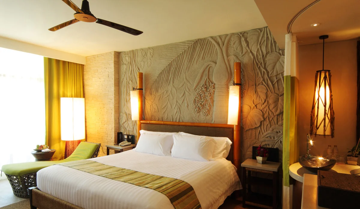
What is the first thing you notice in this room? - Glary (and actually good looking) lights that don't do anything for the unique wall.
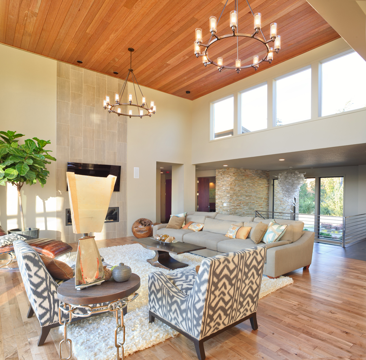
Be bold with your dining room light. Rule of thumb: hang it 30" above the dining table, for high ceilings 36-40" max.
Hope you enjoyed this collection. Stay tuned for more lighting bloopers.


